
Sabrina Ramonov 🍄

YOUTUBE BRAND KIT

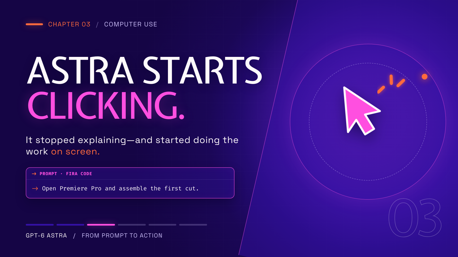
Sample scene
Approved YouTube chapter card showing Expletus Sans title text, Space Grotesk body text and a Fira Code prompt block
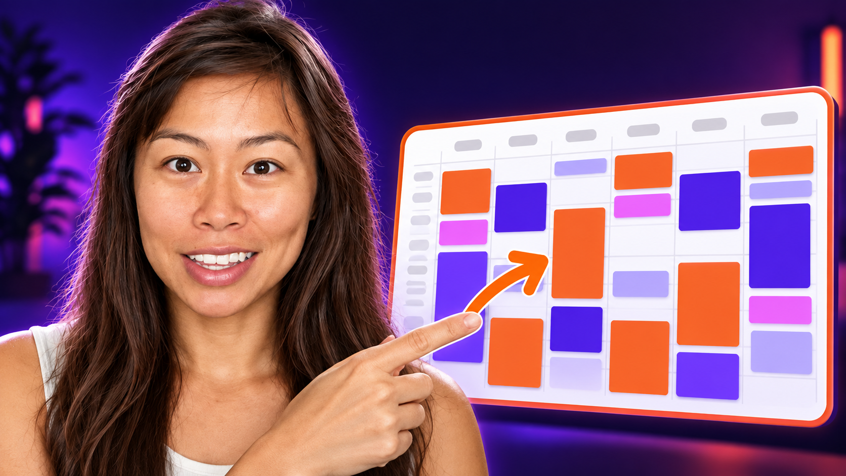
Sample thumbnail
Approved YouTube thumbnail reference showing Sabrina pointing to a colorful content calendar
YouTube banner
YouTube channel banner reading LEARN AI FOR FREE, Featured in Forbes, WSJ, Inc and Business Insider, with a Subscribe button
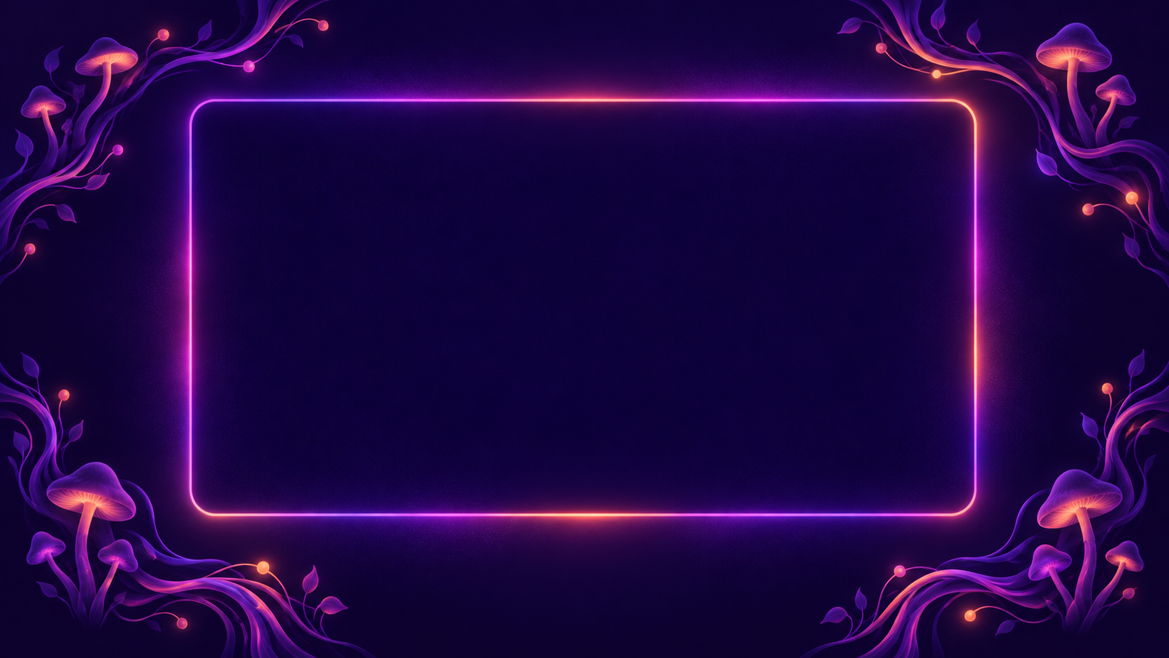
Sample chapter marker
Minimal psychedelic mushroom chapter-marker background with a large clear center framed in Sabrina's purple, violet, pink and orange brand colors

TYPOGRAPHY

ASTRA STARTS CLICKING.

Expletus Sans

Display font for major ideas. Its unusual cuts create the futuristic personality of the channel.

  • Set every Expletus Sans title in ALL CAPS.
  • Use for chapter titles, large statements and short thumbnail phrases.
  • Use Medium 500 or SemiBold 600.
  • Never use for sentences, captions or prompt content.
Download Expletus Sans
It started doing the work on screen.

Space Grotesk

Readable body font for everything the audience must understand quickly.

  • Use for subtitles, explanations, captions and chapter labels.
  • Use Medium 500 for video; Regular 400 is acceptable on the web.
  • At 1080p, start at 42–54 px with 1.2–1.35 line height.
  • Use sentence case and keep on-screen copy to two lines when possible.
Download Space Grotesk
prompt => run({ model: "human" });

Fira Code

Utility font for content that comes from—or behaves like—a computer interface.

  • Use for code, prompts, commands, timestamps, tools and technical output.
  • Use Regular 400 for code and Medium 500 for small labels.
  • Keep prompts inside a defined panel with generous padding.
  • Never use for titles or normal explanatory sentences.
Download Fira Code

COLOR

Background

#150545
ABOUT 55% OF VISUAL WEIGHT

Use behind every frame as the dominant color and source of negative space.

Never replace it with pure black.

Primary violet

#3411A6
ABOUT 25% OF VISUAL WEIGHT

Use for large shapes, solid panels and atmospheric depth.

Use at 90–100% opacity for panels and 30–60% for background washes.

Accent pink

#FF4FE0
ABOUT 15% OF VISUAL WEIGHT

Use for highlighted words, outlines, selected states and soft glow.

Use sparingly. Never set paragraphs in pink.

Accent orange

#FF6A3D
ABOUT 5% OF VISUAL WEIGHT

Use for arrows, badges, cursor activity and small attention signals.

Use sparingly. Never use for paragraphs or large panels.